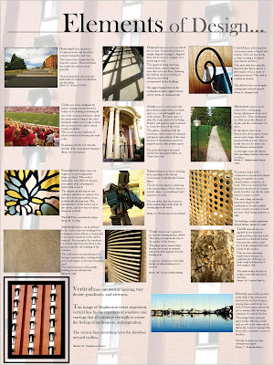

In this assignment, we the task was to create two posters that represented the elements and priniciples of design. The assignment as a whole helped me learn the fundamentals of design by physically going out into the real world and having to find objects that represented them. It helped me visual the meaning a lot more. By making the posters, the challenge was fitting all 29 images on two different posters. It was hard to be unique and artistic, while trying to fit so many pictures because you had to be more organized than abstract. I learned how I could be simple within a grid pattern, but still have a unique outcome. Next time I would work harder on limiting my information, because the more writing I had the sloppier it looked. I needed to refine my information. I would also like to have had pictures from just around campus but I had camera difficulties and had to use previous photos.

No comments:
Post a Comment